
The Brand System
Our visual identity is built on high contrast, deep cinematic backgrounds, and electric accents. Use these guidelines to maintain consistency across all platforms and media.
Electric Midnight
Signature color system
Minimal UI
Content-first design
Bold Type
Mont Black headers
Our Mark
Official Configurations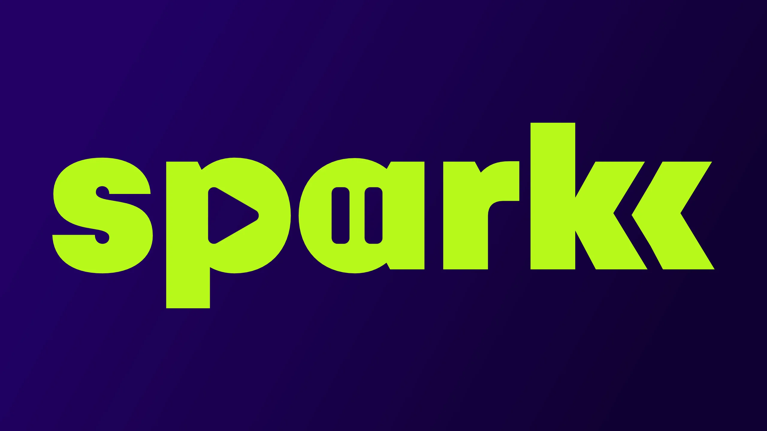
Primary
Main logo for apps, key art, and most placements. High contrast against dark backgrounds.
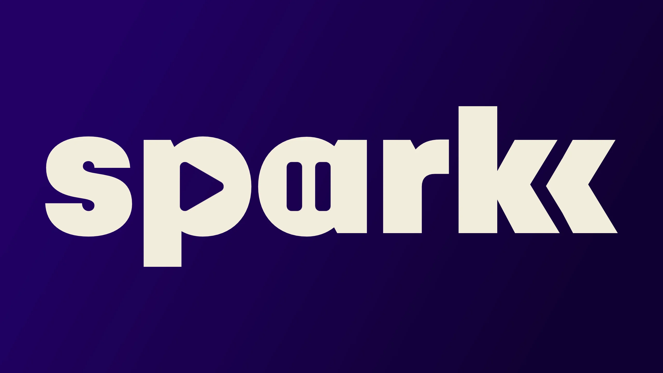
Light
Use when a strictly monochrome mark is required or on complex dark backgrounds.
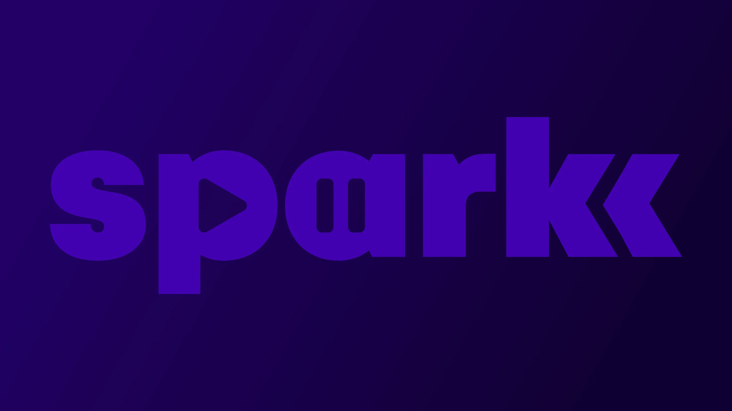
Purple
Use sparingly for special campaigns or stylized executions on light backgrounds.
Do Not: Add glow, shadow, stretch, distort, or change official colors.
Our Palette
Dark Cinematic & Electric AccentsElectric Midnight
#110033
RGB 17, 0, 51
RGB 17, 0, 51
Midnight Horizon
#220066
RGB 34, 0, 102
RGB 34, 0, 102
Sparkk Lime
#B8F818
RGB 184, 248, 24
RGB 184, 248, 24
Cloudlight Cream
#F3EDDE
RGB 243, 237, 222
RGB 243, 237, 222
Neon Pulse
#4302B2
RGB 67, 2, 178
RGB 67, 2, 178
Electric Glass
#00EEFF (5%)
RGB 0, 238, 255
RGB 0, 238, 255
Typography
Font = MontStream
Independent.
Sparkk
Aa Bb Cc Dd Ee Ff
0 1 2 3 4 5 6 7 8 9
Usage Guidelines
Headers
Use Uppercase Mont Black (900) for all major statements and page titles.
Body Text
Use lighter weights (Regular/Light) for paragraphs. Maintain high readability.
Restrictions
Avoid using Heavy/Black weights for long-form paragraphs.
Download Official Assets
Get the complete kit including vector logos, icons, and transparent PNGs. Ideal for app stores, press kits, and sponsor decks.
Coming Soon